
Typography
Typography
At Ziker, typography is a simple task.
Headers
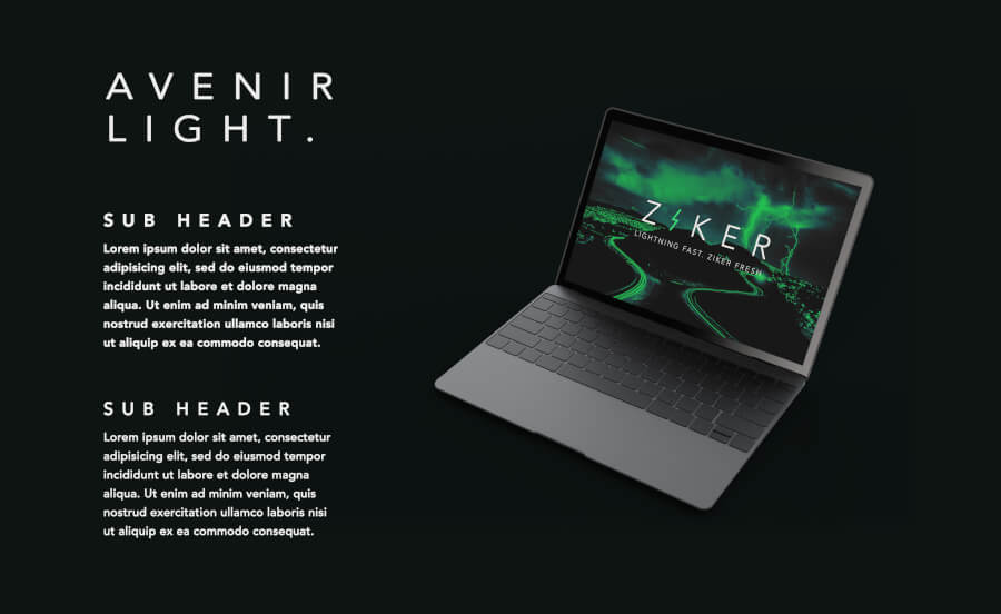
The header is Avenir light, all caps. Track the type out when possible.
Avenir Light WEB
When Avenir is not available, e.g. for web projects, use Open Sans
Open Sans WEB
abcdefghijklmnopqrstuvwxyz
1234567890(,.;:?!$&*)
Weight: 300
Style: Normal
abcdefghijklmnopqrstuvwxyz
1234567890(,.;:?!$&*)
Weight: 300
Style: Italic
abcdefghijklmnopqrstuvwxyz
1234567890(,.;:?!$&*)
Weight: 400
Style: Normal
abcdefghijklmnopqrstuvwxyz
1234567890(,.;:?!$&*)
Weight: 400
Style: Italic
abcdefghijklmnopqrstuvwxyz
1234567890(,.;:?!$&*)
Weight: 600
Style: Normal
abcdefghijklmnopqrstuvwxyz
1234567890(,.;:?!$&*)
Weight: 600
Style: Italic
abcdefghijklmnopqrstuvwxyz
1234567890(,.;:?!$&*)
Weight: 700
Style: Normal
abcdefghijklmnopqrstuvwxyz
1234567890(,.;:?!$&*)
Weight: 700
Style: Italic
abcdefghijklmnopqrstuvwxyz
1234567890(,.;:?!$&*)
Weight: 800
Style: Normal
abcdefghijklmnopqrstuvwxyz
1234567890(,.;:?!$&*)
Weight: 800
Style: Italic
Usage:
HTML
<link href="https://fonts.googleapis.com/css?family=Open+Sans:300,300i,400,400i,600,600i,700,700i,800,800i" rel="stylesheet">JS IMPORT
@import url('https://fonts.googleapis.com/css?family=Open+Sans:300,300i,400,400i,600,600i,700,700i,800,800i');CSS
font-family: 'Open Sans', sans-serif;Avenir and Open Sans, though distinct, should work interchangeably. But never mix the two typefaces.
Avenir is available as a web font, though the cost probably doesn't make using it worth it in most circumstances.
Body Copy
Use Avenir (or Open Sans for web) for all body copy. You can use different weights for different areas on your writing, as long as larger headers are in all-caps.
Do's and Dont's

DO: Occasionally Replace the i with the lightning bolt emblem.

DO: Give the text plenty of negative space.

DO: Use brandjectives and other Ziker-preferred words.

DO: Put light text on dark backgrounds whenever possible.

DON'T: Fill up all of the space and make text appear crowded.

DON'T: Replace any letter that isn't "i."

DON'T: Use other fonts.

DON'T: Replace the i if it makes the world confusing to read. This sample can be difficult for readers with dyslexia / reading disorders.